Code
The branch for this chapter can be found here
Install
First of all we start with the installation of the packages we need.
- Yarn
- npm
yarn add @mui/material @emotion/react @emotion/styled @fontsource/roboto @mui/icons-material
npm install @mui/material @emotion/react @emotion/styled @fontsource/roboto @mui/icons-material
We installed the Material UI base package and the icon package together with support packages for css and the default Roboto font.
- Material, the material components for React
- Emotion, write css styles in Javascript
- Roboto, the default Material UI font
- Material icons, the official Material Icons
Components
Material UI is providing us with a rich set of components that have the Material Design guidelines applied to them and come with a clean Google like styling out-of-the-box. In other words, as soon as installed you can start using these components.
Let's add a text (a.k.a. input) field of which you can find comprehensive documentation with examples here. At the bottom of each component documentation page you will find an API section which gives you a complete reference to all of the properties and classes available to the component mentioned on that page.
Open App.tsx in the components folder and add the TextField import at the top of the file and declare the
TextField component in the body after the anchor (</a>) closing tag.
import React from 'react';
import '../styles/App.css';
import { logo } from "@assets";
import { TextField } from "@mui/material";
function App () {
return (
<div className="App">
<header className="App-header">
<img src={logo} className="App-logo" alt="logo"/>
<p>
Edit <code>src/App.tsx</code> and save to reload.
</p>
<a
className="App-link"
href="https://reactjs.org"
target="_blank"
rel="noopener noreferrer"
>
Learn React
</a>
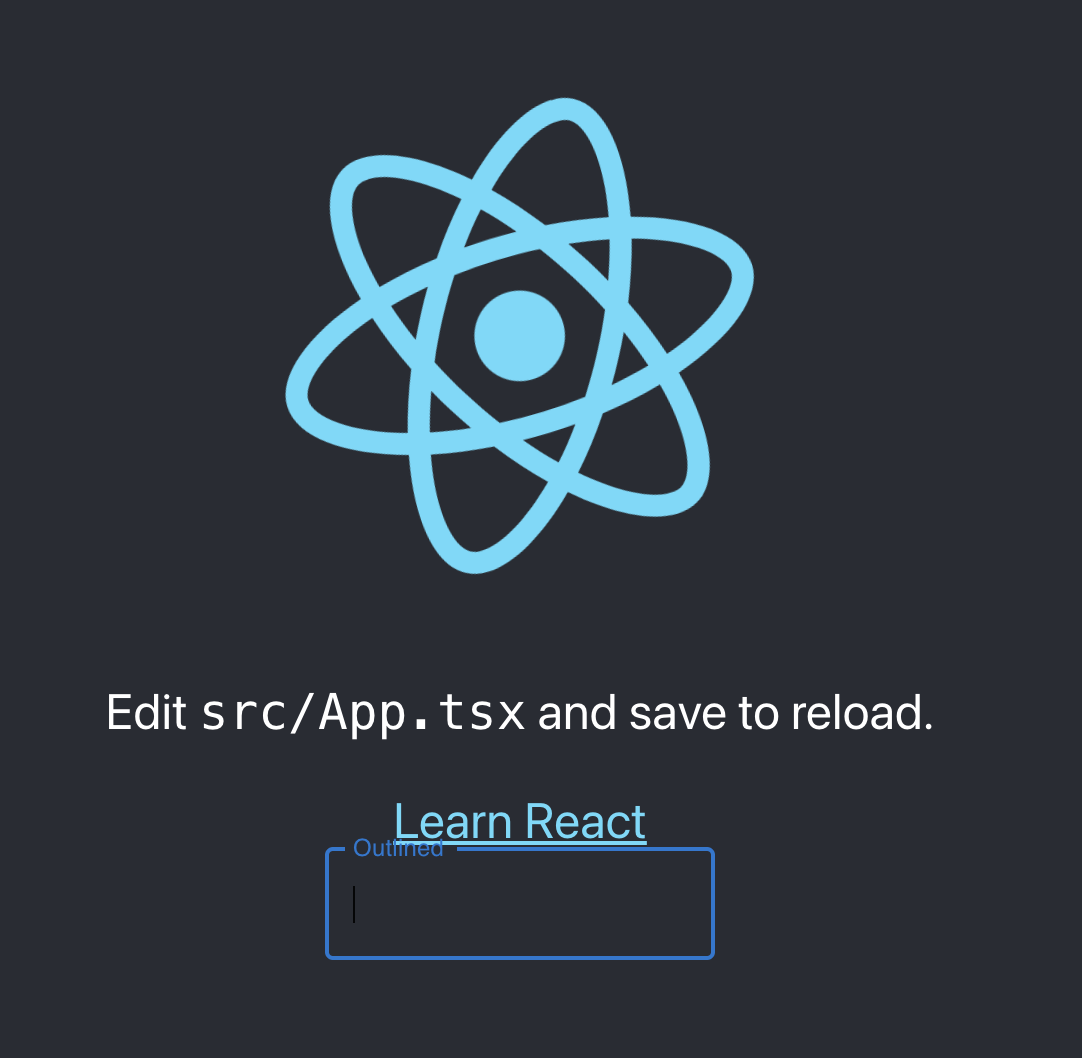
<TextField label="Outlined" variant="outlined"/>
</header>
</div>
);
}
export default App;
The page should refresh since we are running our development server with hot reload.
There you go. An outlined text field with the typical google style appeared ready for use. It has the typical smooth 'googlish' label action when you click in the field. There is a lot more that has been taken care of than meets the eye, apart from looking good and having nice interaction features it also works on virtually every browser. Awesome job.
Although we got awesome components to use now, overall it does not look too shabby as the App is using the styling that was created with using create-react-app. Our next job is to change that.
Theme
We could use the theme that comes with Material UI as-is although in reality you most often want to personalize or brand the coloring of your App. Material UI is also supplied with a powerful and complete theming system. In the next steps we are going to rearrange things a bit so we can make optimal use of the components, branded theme and custom fonts. We also take our first steps in creating a standard layout which provides some consistency in our screens.
Steps to take:
- Rearrange files
- Create and apply your theme file
- Add a custom font
- Create our first layout components
Let's get to it.
Remove CSS
First we get rid of the css files that were created by the create-react-app. Go ahead and delete
@styles/App.css and @styles/index.css
Also remove the css imports
import '../styles/App.css';
import './styles/index.css';
After this the app should be able to compile again without problems. You will notice the App is now without any styling.
ThemeProvider
Next step is to create a theme configuration and add it to our App.
Create @styles/index.ts and add our theme options, in this case we indicate to have a default dark mode and
defined the primary and secondary colors of our color scheme.
import {createTheme, ThemeOptions, responsiveFontSizes} from '@mui/material/styles'

const options: ThemeOptions = {
    palette: {
        mode: 'dark',
        primary: {
            main: '#64b5f6',
        },
        secondary: {
            main: '#76ff03',
        },
    },
}

export default responsiveFontSizes(createTheme(options))
In this theme configuration I chose two colors and opted for dark mode. These are only a few options you can configure for your theme. Material UI provides a vast amount of overrides and configurations you can apply. To help you choose colors and see what it will look like you can use the Mui Theme Creator.
To help with your color study here are some useful resources:
We will get into the different parts of theme options as we progress through building our App.
Now to apply our theme with chosen options in @components/App.tsx
import React from 'react';
import theme from "@styles";
import {ThemeProvider, TextField, CssBaseline} from "@mui/material";

function App() {
    return (
        <ThemeProvider theme={theme}>
            <CssBaseline>
                <TextField variant={'outlined'} label={'Outlined'}/>
            </CssBaseline>
        </ThemeProvider>
    );
}

export default App;
We removed the example code that was created for us and replaced it with our ThemeProvider and the CssBaseline component which serves as a normalization of the styles by fixing some inconsistencies across browsers and devices and adds some resets that help a better styling for our Material UI component styles.
Your App now renders with the dark theme and we can see the TextField we kept in the code to see some rendering.
Awesome!
Custom Font
We also want to use a font type that matches our theme or branding, at the moment we only have the default Roboto font that is used by Material UI.
There are various options to add fonts to your App:
- Add CDN link in your html
- Local hosting and declare in css
- Local hosting and imported in your code
Although all three options are valid and useful we are going to work with Fontsource, an open source project that simplifies self-hosting of fonts in your React project making use of the vast amount of high quality fonts Google offers. And with the availability of other open source fonts on top of that my bet is that in this vast amount of fonts you will find the one you love to use for your App.
We want to self-host to improve performance, making sure which version of the font we are using and we can cache the font for offline use.
So head over to https://fontsource.org and choose any of the many fonts available. Remember, we already install Roboto.
I like the Outfit font, it's a dynamic and a bit informal font.
We are going to add the "variable font" instead of the static version. These variable fonts allow designers and developers to use a single font file that contains multiple variations of the same font with as different weights, widths, and styles. This helps to get smaller file sizes and more flexible design options.
So we install the variable font of Outfit (or any of the fonts you may have chosen).
- Yarn
- npm
yarn add @fontsource-variable/outfit
npm install @fontsource-variable/outfit
To apply the font in our theme as the new default font we add the typography override to our @styles/index.ts
theme configuration.
palette: {
    // ... palette options
}
,
typography: {
    fontFamily: ['Outfit Variable'].join(',')
}
// ... other options
Where 'Outfit Variable' is the name of the font you have chosen. Check the TextField in the app and the
placeholder text should now be displayed in the font of your choice!
Layout Components
We are progressing nicely with the setup of the standard elements that we will be using throughout the lifecycle of our App. Until now we only have a 'lost and lonely' TextField in our App which is not very useful and does not look that good.
Let's create our first custom components that can provide a 'default' layout we can build upon. You can choose this layout as you see fit of course, to help you along we will create a Top and Bottom Menu similar as you might have seen in other Apps and serving as a starting point for the menu items that help users navigate our App.
There are two main components we will create now, let's call them Top Bar and Bottom Menu.
Create a folder layout in @components. This folder serves as the grouping of all the reusable layout
elements for our App. Go ahead and create two new files in this new folder, TopBar.tsx and BottomMenu.tsx
Top Bar
In the TopBar.tsx we add this code. Next we will walk through what we added in this file.
import React from 'react'
import MenuIcon from '@mui/icons-material/Menu'
import AccountIcon from '@mui/icons-material/AccountCircle'
import {Box, AppBar, Toolbar, IconButton, Typography} from "@mui/material"

function TopBar() {

    return (
        <Box sx={{flexGrow: 1}}>
            <AppBar position="static">
                <Toolbar>
                    <IconButton sx={{mr: 2}}>
                        <MenuIcon/>
                    </IconButton>
                    <Typography variant="h6" component="div" sx={{flexGrow: 1}}>
                        Appeltje-C
                    </Typography>
                    <IconButton>
                        <AccountIcon/>
                    </IconButton>
                </Toolbar>
            </AppBar>
        </Box>
    )
}

export default TopBar
We created a simple App header with the help of some Material UI components:
BoxThe Box component is an often used layout component. To make our screens we will most often use a Grid layout, which we will discuss in detail later. Layout components like Box, Container and Grid help us to position things on screen. They are of vital importance to be able to create a clean, solid and responsive layout.
AppBarThe AppBar is a multi purpose component that usually sits at the top of the screen. It can provide content and actions related to the current screen, you can use it for branding, showing screen titles and navigation.
ToolbarThe Toolbar is a helper component that aids in adding options in screen the AppBar such as buttons, menu's and avatars. Here we added a menu, the App title and a user avatar in the Toolbar.
IconButtonAs a variant to the standard button we can also use icon buttons which helps making cleaner menu's without labels where useful.
TypographyTo have your content scale and look consistent it is a good idea to use the Typography component. I used it here to add my github handle/nick in the title bar as App title.
Now go ahead and replace the contents in your @components/App.tsx file with this code
import React from 'react';
import theme from "@styles";
import {ThemeProvider, CssBaseline} from "@mui/material";
import TopBar from "@components/layout/TopBar";

function App() {
    return (
        <ThemeProvider theme={theme}>
            <CssBaseline>
                <TopBar/>
            </CssBaseline>
        </ThemeProvider>
    );
}

export default App;
And a hot reload brings us this beauty!
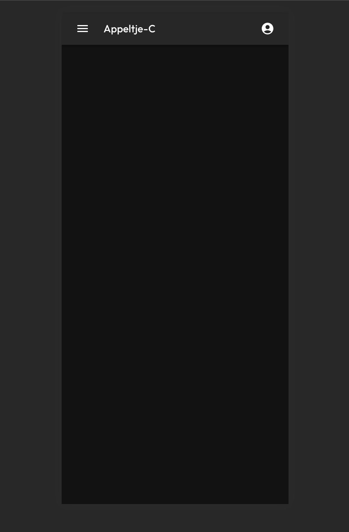
Agreed, there is plenty of room for improvements 😁
Let's add the Bottom Menu as well.
Bottom Menu
Open the BottomMenu.tsx and add this code
import React, {useState} from 'react'
import HomeIcon from '@mui/icons-material/Home'
import PlaceIcon from '@mui/icons-material/Place'
import FavoriteIcon from '@mui/icons-material/Favorite'
import {BottomNavigation, BottomNavigationAction, Paper} from "@mui/material"

function BottomMenu() {

    const [value, setValue] = useState(0)

    return (
        <Paper sx={{position: 'fixed', bottom: 0, left: 0, right: 0}} elevation={3}>
            <BottomNavigation
                showLabels
                value={value}
                onChange={(event, newValue) => {
                    setValue(newValue);
                }}>
                <BottomNavigationAction label="Home" icon={<HomeIcon/>}/>
                <BottomNavigationAction label="Favorites" icon={<FavoriteIcon/>}/>
                <BottomNavigationAction label="Map" icon={<PlaceIcon/>}/>
            </BottomNavigation>
        </Paper>
    )
}

export default BottomMenu
And add it to our App.tsx
import React from 'react';
import theme from "@styles";
import {ThemeProvider, CssBaseline} from "@mui/material";
import TopBar from "@components/layout/TopBar";
import BottomMenu from "@components/layout/BottomMenu";

function App() {
    return (
        <ThemeProvider theme={theme}>
            <CssBaseline>
                <TopBar/>
                <BottomMenu/>
            </CssBaseline>
        </ThemeProvider>
    );
}

export default App;
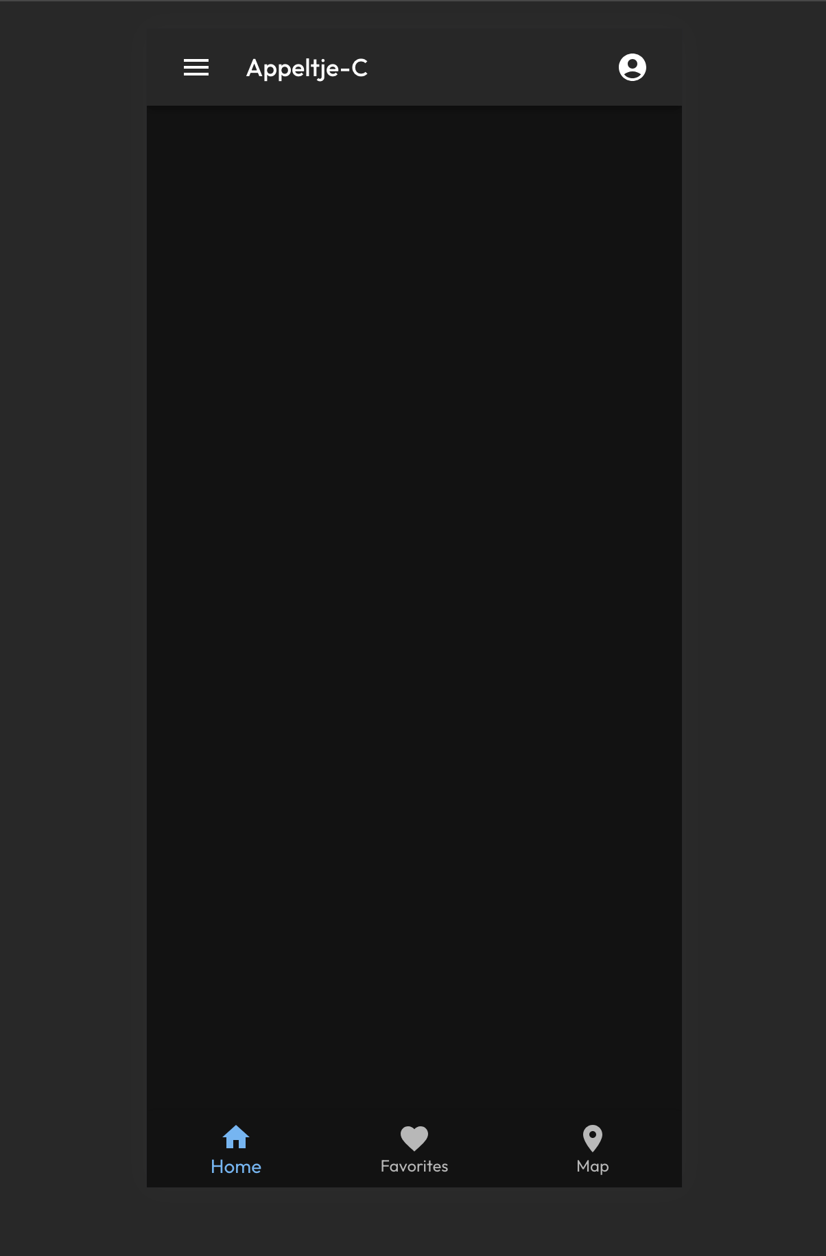
Looking good! We now have a 'sticky' navigation menu sitting at the bottom of our App as well. It looks pretty clean and check out the transition animations on the buttons, look pretty 'Appy' I would say 🚀
The buttons do not navigate anywhere yet, let's dive into that with adding Routing in the next chapter.